


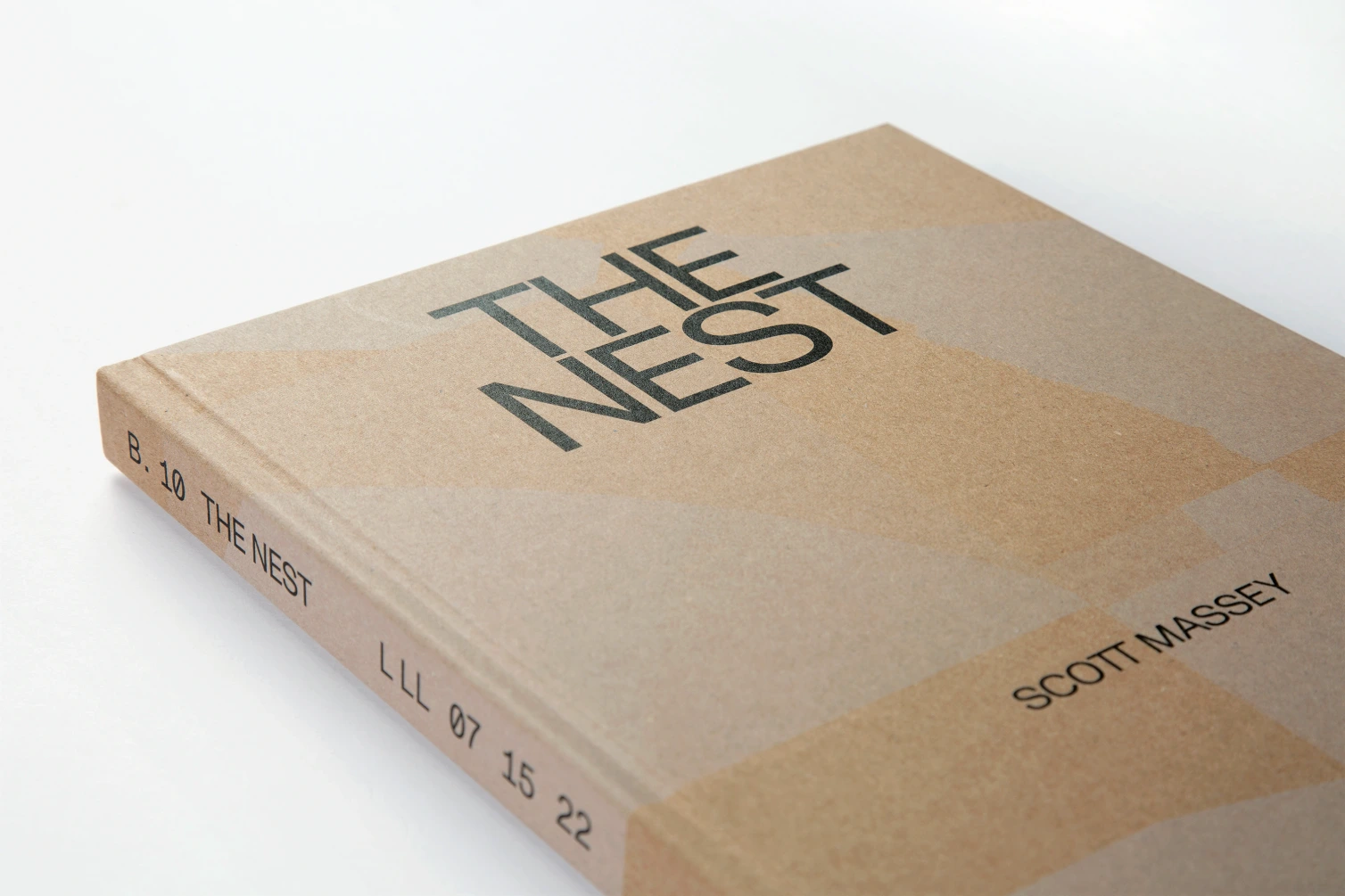
Grammage, bulk and opacity: what defines paper quality?

Two paper samples carry the same specification: 120 g/m². Yet one feels compact and smooth, while the other is noticeably thicker and softer. There is no contradiction. Grammage describes the weight of a given area of paper. Other properties determine its feel, opacity and the way images appear on it.
When choosing paper for a brochure, catalogue or annual report, it pays to look beyond grammage. What matters is how the material, design and intended use work together. A substantial catalogue has different requirements from a short corporate brochure or letterhead that will be printed on again in the office.
Grammage, thickness and bulk: three different measurements
Grammage is the mass of paper per unit of area. A 120 g/m² paper weighs 120 grams per square metre. This lets you calculate the weight of a sheet, but not its thickness.
Paper thickness is the distance between its two surfaces. It is often stated in micrometres. 100 micrometres equals 0.1 millimetres.
Specific volume, or bulk, relates thickness to grammage. It describes how much space a given mass of paper occupies. Paper specifications may describe this as “1.0 bulk” or “1.5 bulk”. At the same grammage, higher bulk means thicker paper.
Europapier: paper glossary (in German)
For example, two papers both weigh 120 g/m². Paper A has a specific volume of 1.0 cm³/g, and Paper B has a specific volume of 1.5 cm³/g. This gives the following calculated values:
| Property | Paper A | Paper B |
|---|---|---|
| Grammage | 120 g/m² | 120 g/m² |
| Specific volume | 1.0 cm³/g | 1.5 cm³/g |
| Calculated thickness | 120 µm / 0.12 mm | 180 µm / 0.18 mm |
For these units: Thickness in µm = grammage in g/m² × specific volume in cm³/g. In this example, Paper B is 50% thicker. At the same sheet size, both still weigh the same. These figures are a calculation example, not specifications for particular paper grades.
This difference has practical implications for a catalogue: at the same page count, a high-bulk paper can produce a more substantial book block without inherently adding weight. The final spine width also depends on binding and finishing and is agreed with the printer.
Greater thickness does not automatically mean greater stiffness. A sheet’s resistance to bending also depends on its structure and grain direction. A paper sample answers this question better than grammage alone.
Opacity: when the reverse side affects reading
Opacity describes how effectively paper blocks what is behind it. It is expressed as a percentage: the higher the value, the more opaque the paper. This matters for double-sided printing, as content on the reverse can otherwise interfere visually with the front.
Europapier: opacity (in German)
Consider an annual report with a small table on a white background on one page and a dark photo on the reverse. If the photo shows through strongly, the table looks cluttered. A paper that works well for a light text layout may be less suitable for this combination.
You cannot reliably infer the opacity of different paper grades from grammage alone. Compare the opacity values in the technical data sheets, then assess a sample printed on both sides.
It is also important to distinguish show-through from strike-through. Show-through occurs when printing on the reverse is visible through the paper. Strike-through occurs when components of the ink penetrate far enough to affect the other side. A higher opacity value therefore does not solve every problem involving the reverse side.
In practice, there is no universal minimum value for all brochures. Font size, contrast, ink coverage and the positioning of content on both sides must be assessed together.
Coated or uncoated: how the surface makes a difference
Coated papers have a layer of pigments and binders applied to modify their surface. They can be gloss, silk or matt. “Matt” therefore does not automatically mean “uncoated”.
Fachverband Medienproduktion: coated paper (in German)
An even, smooth surface can support fine image detail and sharp outlines. This is an important consideration for a product catalogue containing small technical illustrations or many photographs. Always assess the actual paper: coated grades also vary in feel, gloss and image appearance.
Uncoated papers do not have this pigment coating. Their surface may be rough and tactile, or comparatively smooth. They are therefore not a uniform material group whose qualities can be judged simply by touch.
Images on uncoated paper can appear softer and less contrasty. This can be used creatively, but it must suit the visual style. Images with many dark details need particularly careful assessment before production. The specific paper, printing method and corresponding artwork preparation are decisive.
Business stationery raises another question: will the paper be written on with a ballpoint pen, stamped or subsequently printed on an office laser or inkjet printer? The chosen grade must be confirmed as suitable for those uses. A pleasant surface alone is not enough.
Paper colour: the background is part of the image
Warm white and cool white papers change the appearance of the same image. This is particularly noticeable in light image areas, grey tones and subtle blocks of colour.
In standard four-colour printing, white is not applied as a separate ink. White areas are unprinted paper. The paper shade therefore directly affects the result, and changing the image file can compensate for this only to a limited extent.
Some papers contain optical brightening agents. These convert UV radiation into visible bluish light, which can make the paper appear whiter. The perceived strength of this effect depends on the lighting.
Fachverband Medienproduktion: working with optically brightened papers (in German)
Compare samples side by side under the same lighting. For final colour approval, the printer and designer should also agree which proof meaningfully represents the planned printing conditions. An unprinted paper swatch shows shade and texture, but not the finished printed image.
You cannot judge sustainability by touch
A rough, slightly tinted paper often feels natural. That does not in itself establish its environmental impact. Equally, a bright, smooth paper may be made from recycled fibres. Surface, fibre origin and environmental certification are separate criteria.
The German Environment Agency recommends recycled paper carrying the Blue Angel label. In recycled papers certified accordingly, the paper fibres come entirely from recovered paper. The label applies to the specific certified product; it does not automatically certify the eventual printed product.
German Environment Agency: recycled paper (in German)
The amount of material required also matters. For example, a catalogue with 100 inner pages at finished A4 size contains 50 sheets. At 120 g/m², that paper weighs around 374 grams; at 100 g/m², around 312 grams. The difference is approximately 62 grams per copy. This calculation excludes the cover, ink, adhesive, packaging and production waste.
The lower grammage is a sensible option if opacity, handling and finishing remain suitable. The example demonstrates a weight reduction, not a calculated CO₂ saving. Whether lighter paper is appropriate depends on the finished product.
Checklist: comparing paper samples effectively
Where possible, compare two or three suitable grades using the same print product:
The right paper serves the purpose of the print product: it keeps information legible, delivers the desired visual effect and works in production. A higher grammage is neither a requirement nor a guarantee.
Printmedia experts helps you choose paper for brochures & magazines and catalogues & reports, matching the material to the production process.
Enquire about a project
Read more
 Print files
Preparing print-ready artwork: understanding bleed, safety margins and image resolution
Bleed, safety margins and image resolution explained clearly, with a checklist covering format, colours, fonts and PDF export for reliable print files.
Read article
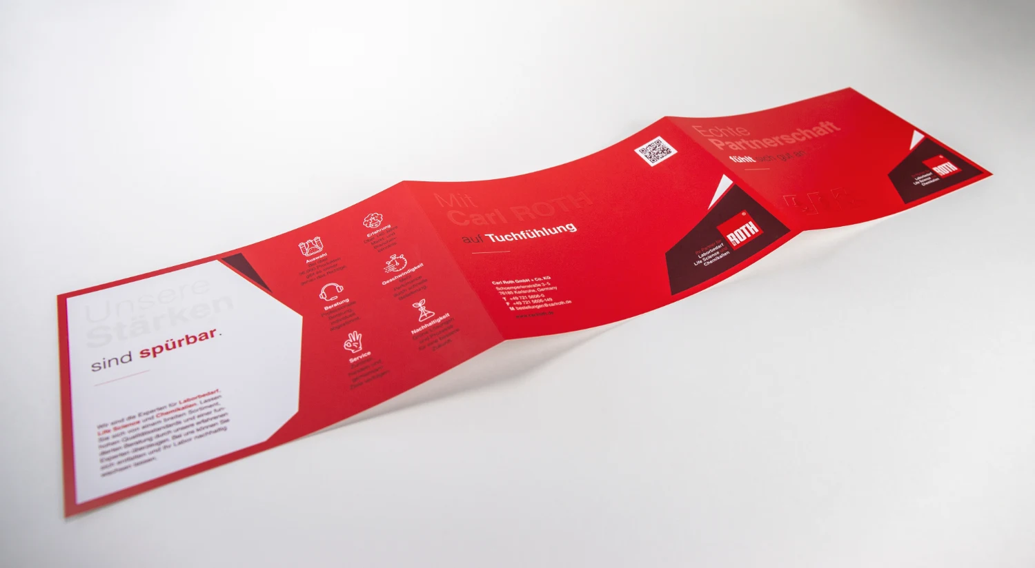 Finishing & binding
Roll fold, concertina fold or cross fold: which suits your content?
The fold determines how a leaflet opens and reads. Learn how to match your content, page layout and paper to the right folding method.
Read article