


Preparing print-ready artwork: understanding bleed, safety margins and image resolution

The layout is agreed, the text is approved and the PDF looks perfect on screen. Yet production can still reveal white edges, blurred images or small text that lacks clarity. The cause often lies in details that are barely noticeable in a normal screen view.
Print files must suit the product being made. An unfolded flyer has different requirements from a multi-panel leaflet or a bound brochure. Understanding the essentials helps you prepare files more accurately and reduces queries before production.
Bleed and safety margins serve different purposes
Many products are trimmed to their final size after printing. Small production tolerances are unavoidable. This is where bleed and safety margins come in.
Bleed lies outside the finished size. Images and blocks of colour intended to reach the edge of the paper must extend beyond the trim line. This prevents an unprinted white edge if the cut varies slightly.
The safety margin lies inside the finished size. Text, logos and important image details are kept away from the eventual trim edge. This keeps them fully visible despite small variations and prevents them from looking cramped against the edge.
Here is a simple example: a flyer needs to measure 148 × 210 millimetres after trimming. If a three-millimetre bleed is agreed on all sides, the artwork including bleed measures 154 × 216 millimetres. The finished size remains unchanged.
Three millimetres is an example. The specifications for the product ordered are what matter. The required distance between content and trim, fold or binding edges must also suit the product.
Bleed on the outside. Safety margin on the inside.
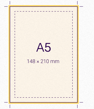
- Bleed
- 3 mm on all sides in this example. Images and colour backgrounds extend to the outer edge.
- Finished size / trim line
- 148 × 210 mm after trimming. The solid line marks the finished size.
- Safety margin
- Text and important details stay within the dashed area. We agree the distance from the edge for each product.
Setting a bleed area is only the first step
A common mistake is to set up bleed in the document while leaving the background image ending exactly at the trim edge. The export then includes an extra area, but that area is empty.
Elements that run to the edge must actually extend into the bleed area. After export, check the trim line and the content beyond it.
Crop marks serve a different purpose. They indicate a position but do not replace bleed. Check in advance whether marks are required in the supplied file. Adobe also recommends agreeing the required printer’s marks with your print provider.
Always check image resolution at the size used
For print output, a photo’s resolution is best considered in pixels per inch, or ppi. What matters is how many image pixels are spread across the area that will actually be printed.
An image 2,400 pixels wide has a resolution of exactly 300 ppi at a print width of 20.32 centimetres. If the same image is placed at twice that width without adding pixels, its effective resolution falls to 150 ppi.
The calculation is:
Effective resolution = number of pixels ÷ print width in inches
Same image. Twice the width. Half the resolution.
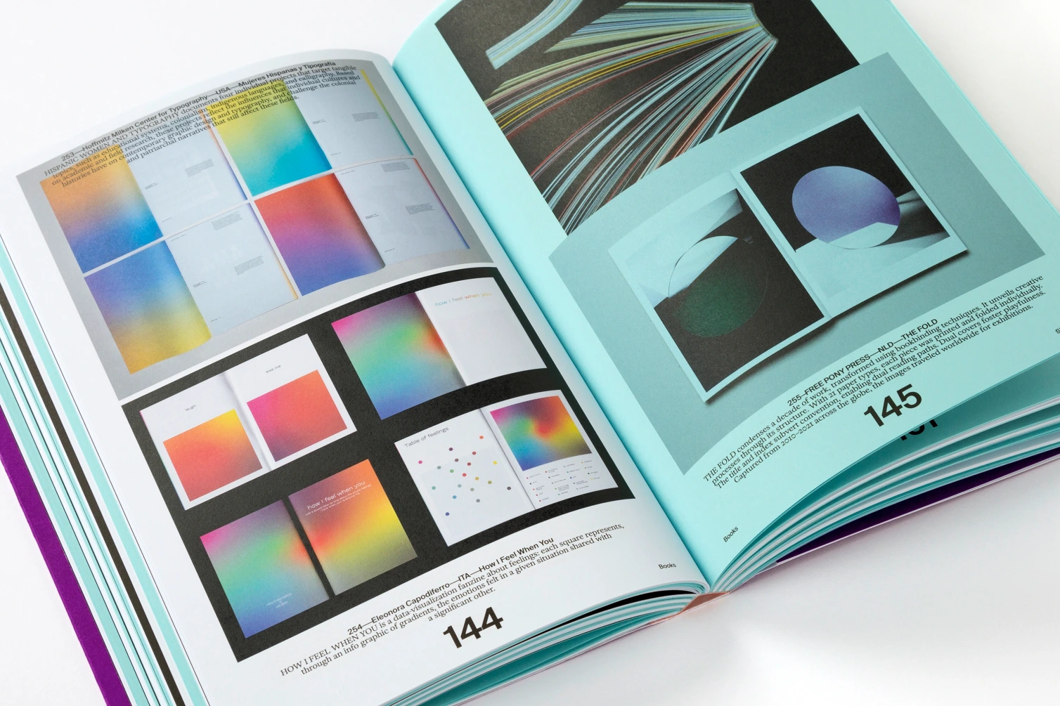
300 ppi
20.32 cm print width
150 ppi
40.64 cm print width
One inch equals 2.54 centimetres. Layout software can display the effective resolution of placed images, so manual calculations are usually unnecessary. Adobe also explains the distinction between pixel dimensions, output size and resampling.
For many photos in brochures and flyers, around 300 ppi at final size is a common guideline. The actual requirement depends on the image, printing method and viewing distance. A large poster viewed from several metres away needs to be assessed differently from a small product image with fine detail.
A high pixel count does not guarantee a sharp photograph. Motion blur, heavy compression and missing detail remain problems even when the file’s calculated resolution is sufficient.
Keep logos and fonts as vectors where possible
Photos are made up of pixels. Many logos, lines and letterforms, however, can be stored as vectors. Their outlines are described mathematically and can be scaled without the pixelation typical of raster graphics.
For a logo, the original vector file is therefore usually more suitable than a screenshot from a presentation. The actual content is what matters: a PDF can also contain nothing more than a low-resolution image.
Fonts should be embedded in the print PDF. This makes the required characters available without the recipient having to substitute a different font. Correct embedding can also use a subset containing only the characters used.
After export, pay particular attention to special characters, accented letters, currency symbols and unusual font styles. Errors can arise during export and may therefore not have been visible in the original layout.
Black text and fine lines need care
In standard CMYK printing, small black text is often set in the black channel only: 0% cyan, magenta and yellow, and 100% black. If fine letterforms use several printing colours, small registration differences can create coloured fringes.
Large black areas have different requirements. A carefully specified rich black with additional colour components may be appropriate. Its composition depends on the paper and production conditions. Adobe also distinguishes between process black and rich black and recommends agreeing the colour values with your print provider.
Lines should have a defined thickness. Very fine or pale lines can be difficult to see, depending on the material and printing method. Thin white lines and small white text within dark areas are particularly sensitive.
A printout at actual size helps you judge proportions and legibility. However, a definitive assessment of critical details must take the planned production into account.
Match PDF export settings to the job
Before handing over files, ask which PDF settings, colour profiles and spot colour specifications are required. Simply converting all content to an arbitrary CMYK profile is not a reliable approach.
The page arrangement must also be correct. Brochures are often supplied as consecutive single pages. Folded leaflets, on the other hand, may require fully assembled outside and inside layouts. Follow the agreed file structure.
Give the approved file an unambiguous name. If changes are made later, make it clear which version replaces the previous one.
What preflight detects, and what you need to check yourself
A preflight check examines a file’s technical properties against defined rules. These may cover fonts, image resolution, colour spaces, transparency and ink coverage. The results are only useful if the check profile matches the production requirements.
A technically sound file can still contain an incorrect price or an outdated telephone number. A high-resolution photo of the wrong product may also pass a technical check.
That is why technical file checks and content approval go hand in hand.
File handover checklist
Before sending the final file, confirm the following:
Are your files ready for print?
Printmedia experts checks your print files against the planned production requirements and agrees any necessary changes with you or your agency.
Enquire about artwork checks and preparationRead more
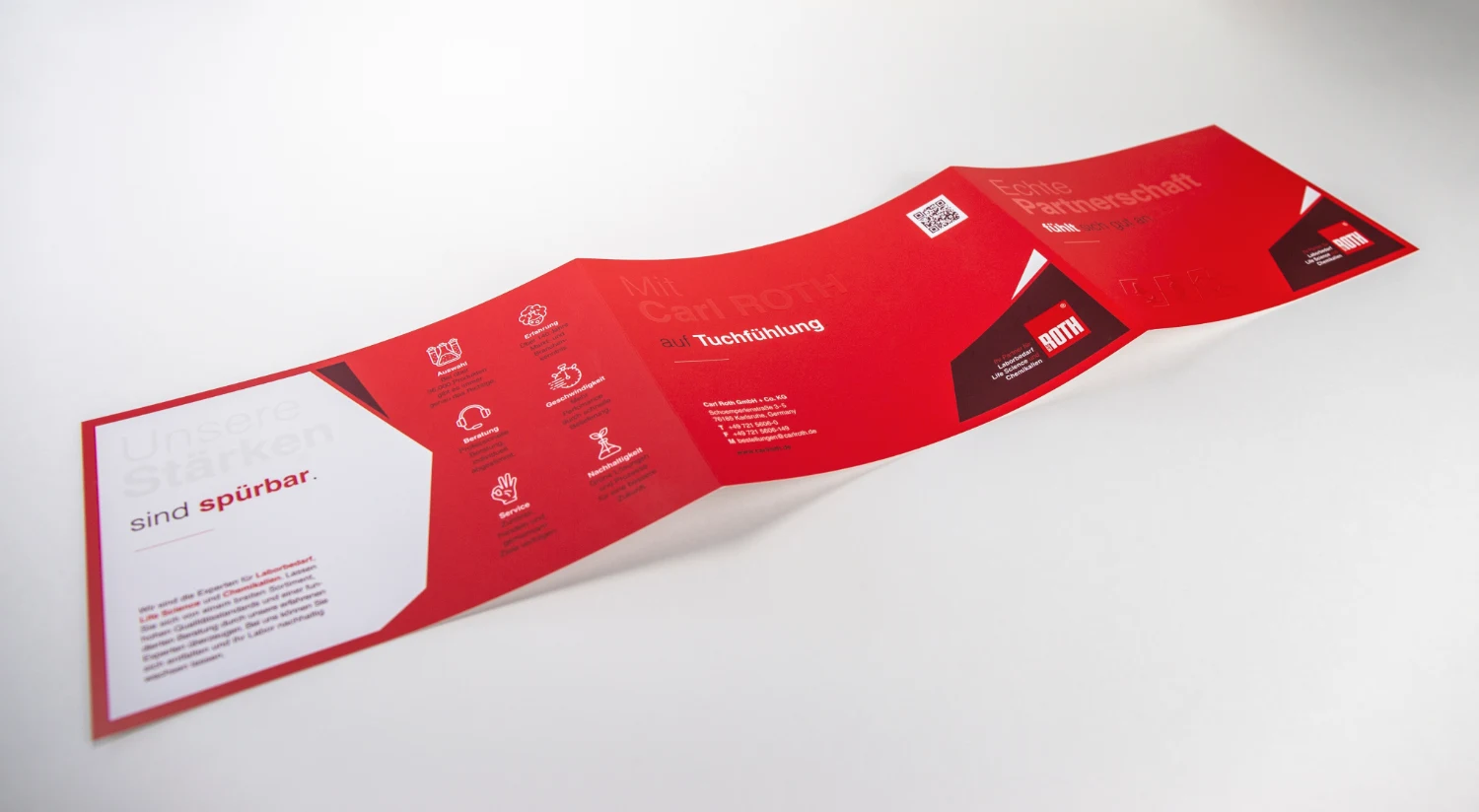 Finishing & binding
Roll fold, concertina fold or cross fold: which suits your content?
The fold determines how a leaflet opens and reads. Learn how to match your content, page layout and paper to the right folding method.
Read article
 Paper & materials
Grammage, bulk and opacity: what defines paper quality?
The same weight, a different feel: why papers vary in thickness, opacity and texture, and how to choose the right material.
Read article